Chart Panel
The Chart panel brings professional-grade price visualization to your prediction market analysis. Whether you're trying to understand how a market has moved over time, spot trends before they fully develop, or simply watch prices tick in real-time, the Chart panel gives you the visual tools you need.
Opening the Panel
Press / to open the Command Palette, type CHT, and press Enter. A new Chart panel will appear in your workspace, ready for you to select a market to visualize.
Selecting a Market to Chart
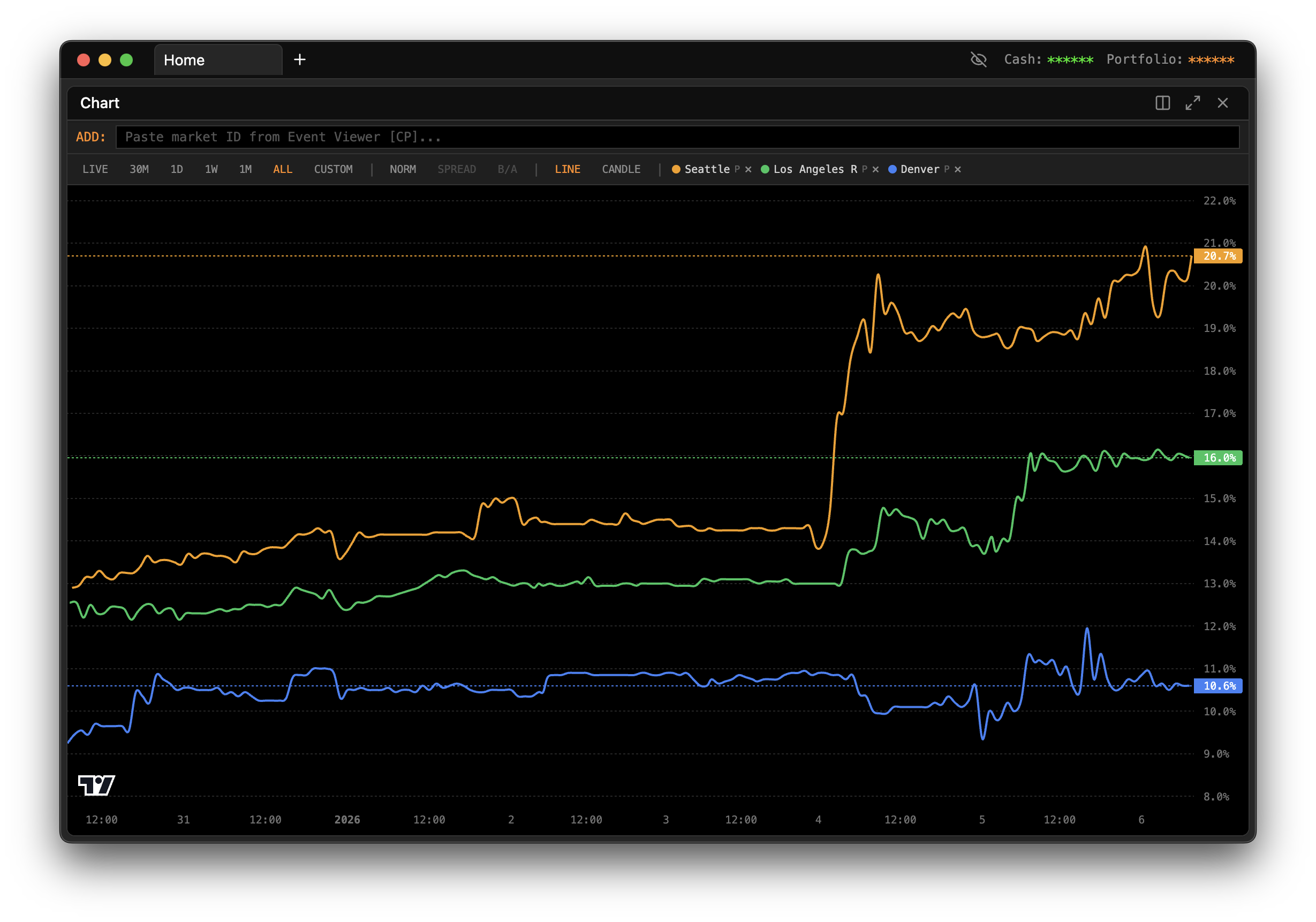
When you first open the Chart panel, you'll need to tell it which market to display. Use the market selector dropdown at the top of the panel to browse available markets. You can choose between exchanges (Kalshi or Polymarket) and then drill down to the specific market you want to analyze.
Once selected, the chart immediately begins loading historical price data and, if the market is active, starts streaming live updates.
Navigating Through Time
The chart offers multiple time range presets that let you zoom in on recent action or zoom out for the bigger picture.
LIVE mode is where the action happens. In this mode, the chart streams real-time data as trades occur. You'll see new candles forming in real-time, prices ticking up and down, and the current bid/ask spread moving with the market. Use this when you're actively monitoring a market or waiting for a specific price level.
30M (30 Minutes) gives you a tight view of the most recent half hour. This is useful for seeing very short-term momentum and recent price action. If you're trying to time an entry or exit, this view shows you exactly what's been happening in the immediate past.
1D (1 Day) expands your view to the last 24 hours. This time frame is excellent for understanding intraday patterns and seeing how the market has moved throughout the current day. You can spot when major price moves happened and whether the current price represents a local high, low, or somewhere in between.
1W (1 Week) pulls back further to show an entire week of price history. At this level, you start seeing broader trends emerge. Daily fluctuations smooth out, and you can identify whether the market has been trending up, down, or ranging sideways over the past week.
1M (1 Month) gives you a full month of context. This view is valuable for understanding the market's overall trajectory and for seeing how current prices compare to where the market has been trading historically.
ALL shows every piece of price data available for the market, from the moment it opened to the present. This comprehensive view helps you understand the complete story of the market—where it started, any major moves it's made, and how it's arrived at its current price.
CUSTOM lets you define your own date range. If you want to focus on a specific period—say, the week surrounding a particular news event—you can set exact start and end dates.
Reading the Candlestick Chart
The chart displays price data using candlesticks, a visualization method that packs a lot of information into each time period.
Each candlestick represents a single time period (the length depends on your selected time range and zoom level). The body of the candle shows the opening and closing prices for that period. If the candle is green, it means the price closed higher than it opened—the market moved up during that period. If the candle is red, the price closed lower than it opened—the market moved down.
The thin lines extending above and below the candle body are called wicks or shadows. The top of the upper wick shows the highest price reached during that period, while the bottom of the lower wick shows the lowest price. Together, the body and wicks tell you not just where the price started and ended, but the full range it traveled.
A long wick above a candle body suggests that buyers pushed the price up during the period, but sellers ultimately pushed it back down before the close. A long wick below suggests the opposite—sellers drove the price down, but buyers stepped in and pushed it back up.
The Bid/Ask Spread
When viewing live data, you'll often see two horizontal lines on the chart representing the current bid and ask prices.
The bid line shows the highest price that buyers are currently willing to pay. If you wanted to sell immediately, this is the price you'd receive.
The ask line shows the lowest price that sellers are currently willing to accept. If you wanted to buy immediately, this is the price you'd pay.
The gap between these two lines is the spread. A narrow spread indicates a liquid market where you can enter and exit positions efficiently. A wide spread suggests less liquidity—you'll pay more to get in and receive less when you get out.
Volume Visualization
Below the main price chart, you'll find volume bars that show trading activity for each time period. Taller bars mean more trading occurred during that period; shorter bars mean less activity.
Volume is a crucial context for price movements. A price move on high volume suggests strong conviction—many traders are participating in the move. A price move on low volume might be less significant, as it doesn't represent broad market agreement.
Pay attention to volume spikes. Unusually high volume often accompanies important price levels or news events, and can signal the start of a significant move.
Interacting with the Chart
The chart is fully interactive, letting you explore the data in detail.
Scroll your mouse wheel to zoom in and out on the time axis. Zooming in shows more detail for fewer time periods; zooming out shows more history with less detail per candle.
Click and drag to pan left and right through time. This lets you scroll back into history without changing your zoom level.
Double-click anywhere on the chart to reset the view to its default zoom and position.
Hover over any candle to see a tooltip with exact values: the open, high, low, and close prices for that period, plus volume if available.
Combining Chart with Other Panels
The Chart panel becomes even more powerful when used alongside other panels. A common setup is to have a Chart and Order Book panel side by side for the same market. The Chart shows you the historical context and current trend, while the Order Book shows you the real-time depth of buy and sell orders waiting to be filled.
Another useful combination is Chart plus Event Viewer. Use the Event Viewer to browse markets and find ones that interest you, then open a Chart panel for deeper price analysis on the markets you've identified.
When the Chart Doesn't Load
If the chart isn't showing data, first verify that the market you selected is active and has trading history. Brand new markets may not have enough data to display a meaningful chart. Also check your internet connection, as the chart needs to fetch data from exchange APIs.
If you're in LIVE mode but not seeing updates, make sure the market is currently open for trading. Some prediction markets have specific trading hours or close when an event begins. Try switching to a historical time range like 1D to confirm the chart is working, then switch back to LIVE.